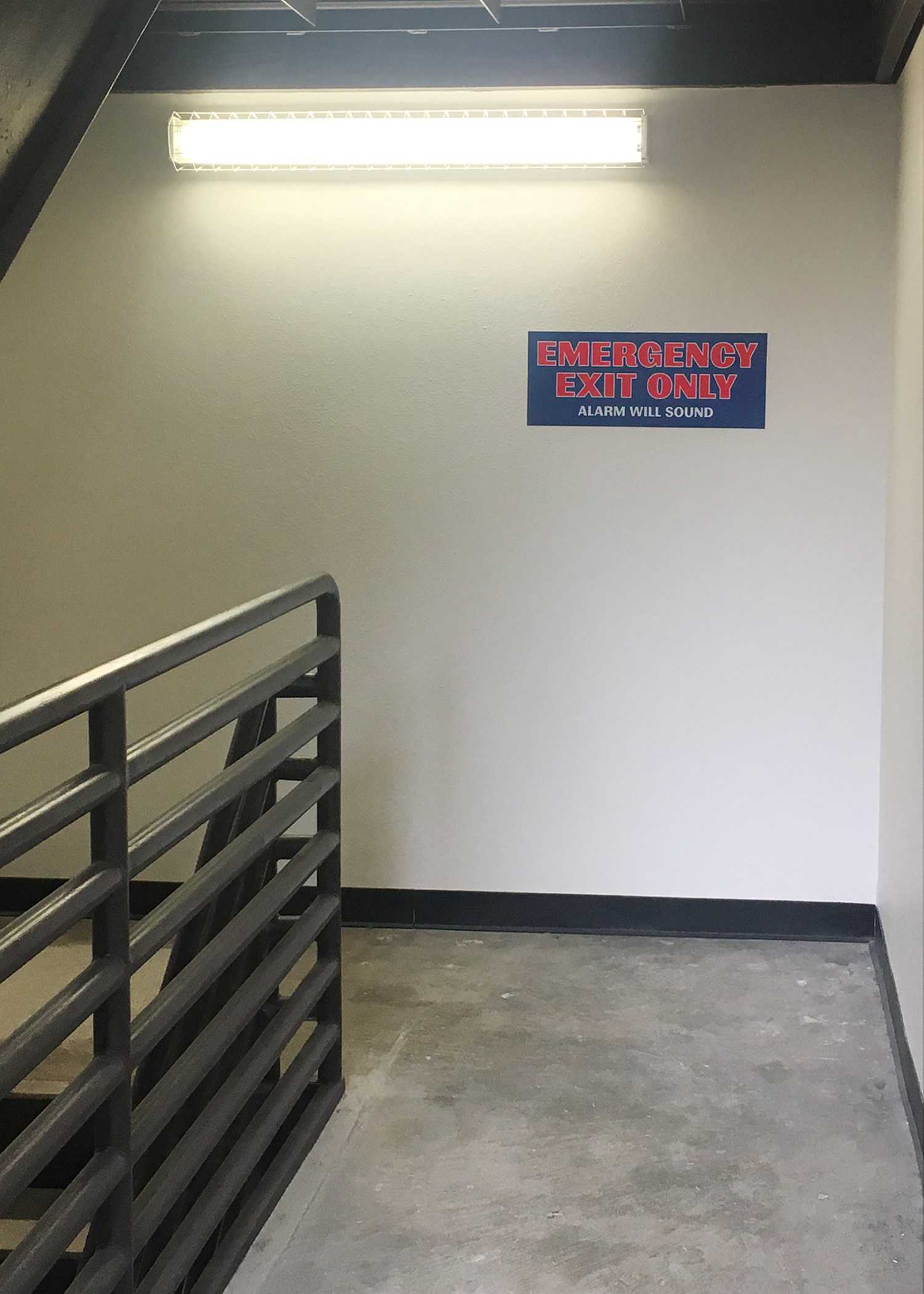
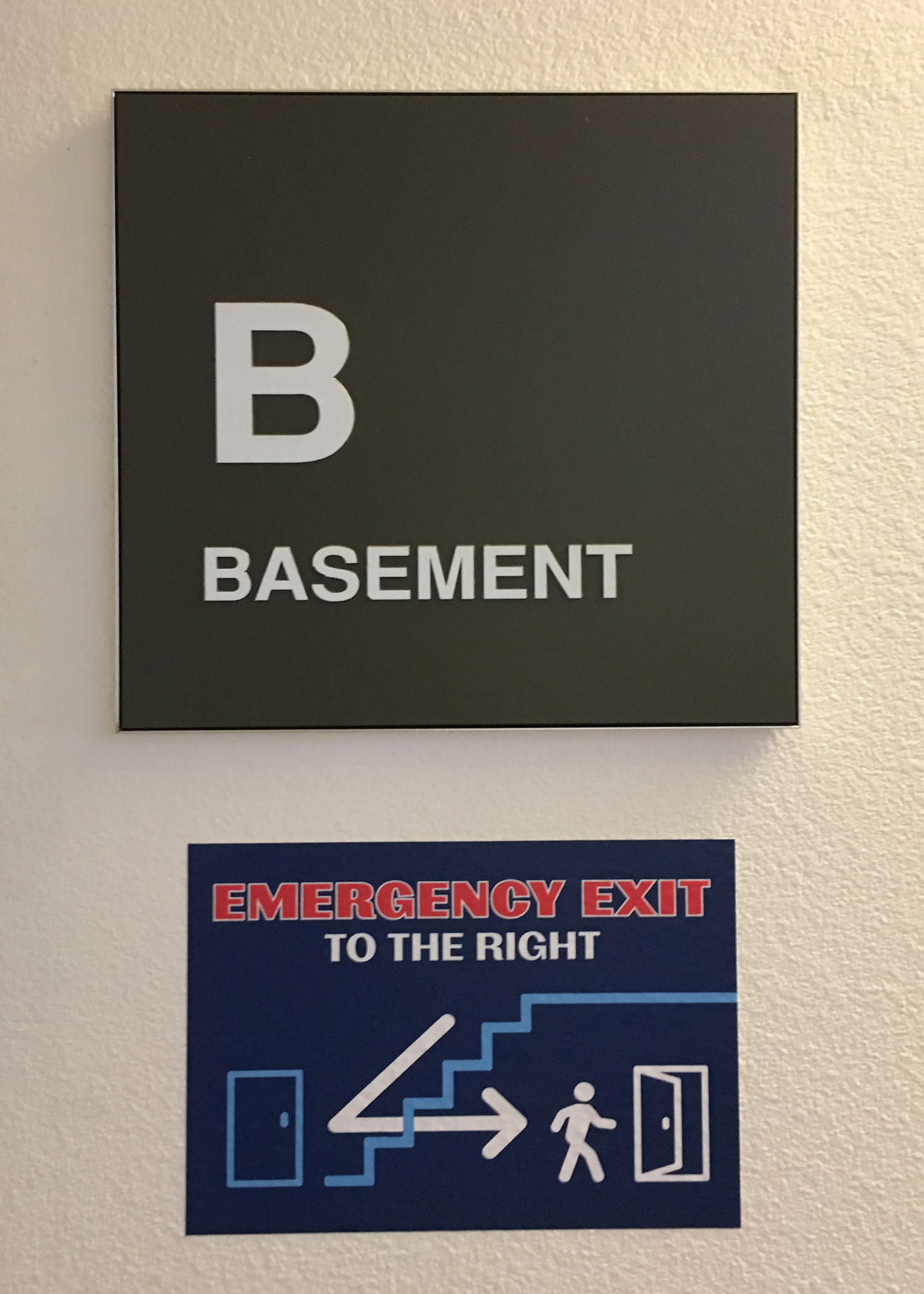
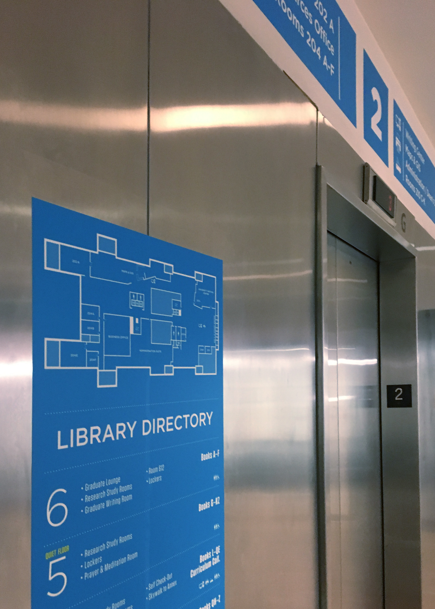
Directional Signage
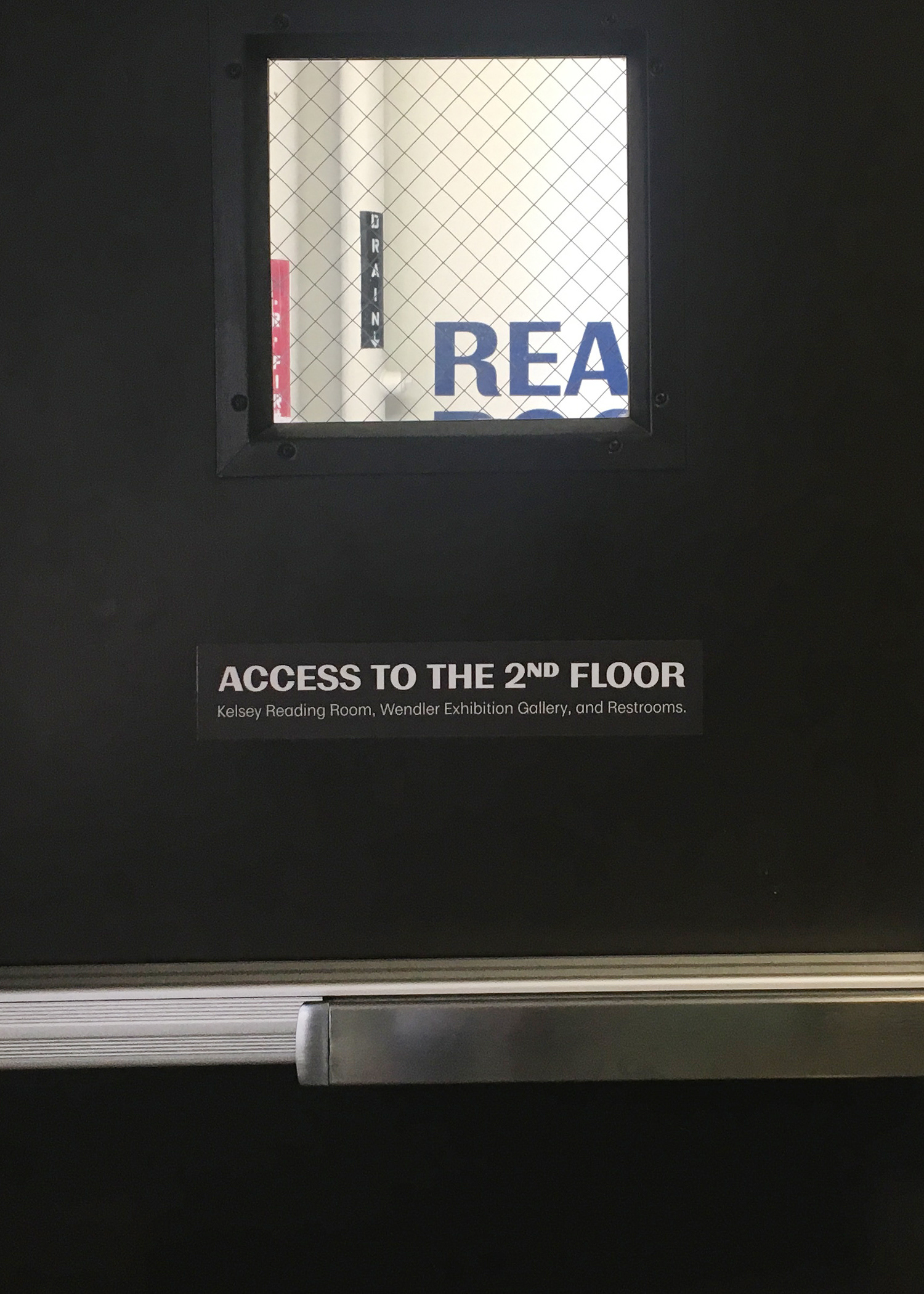
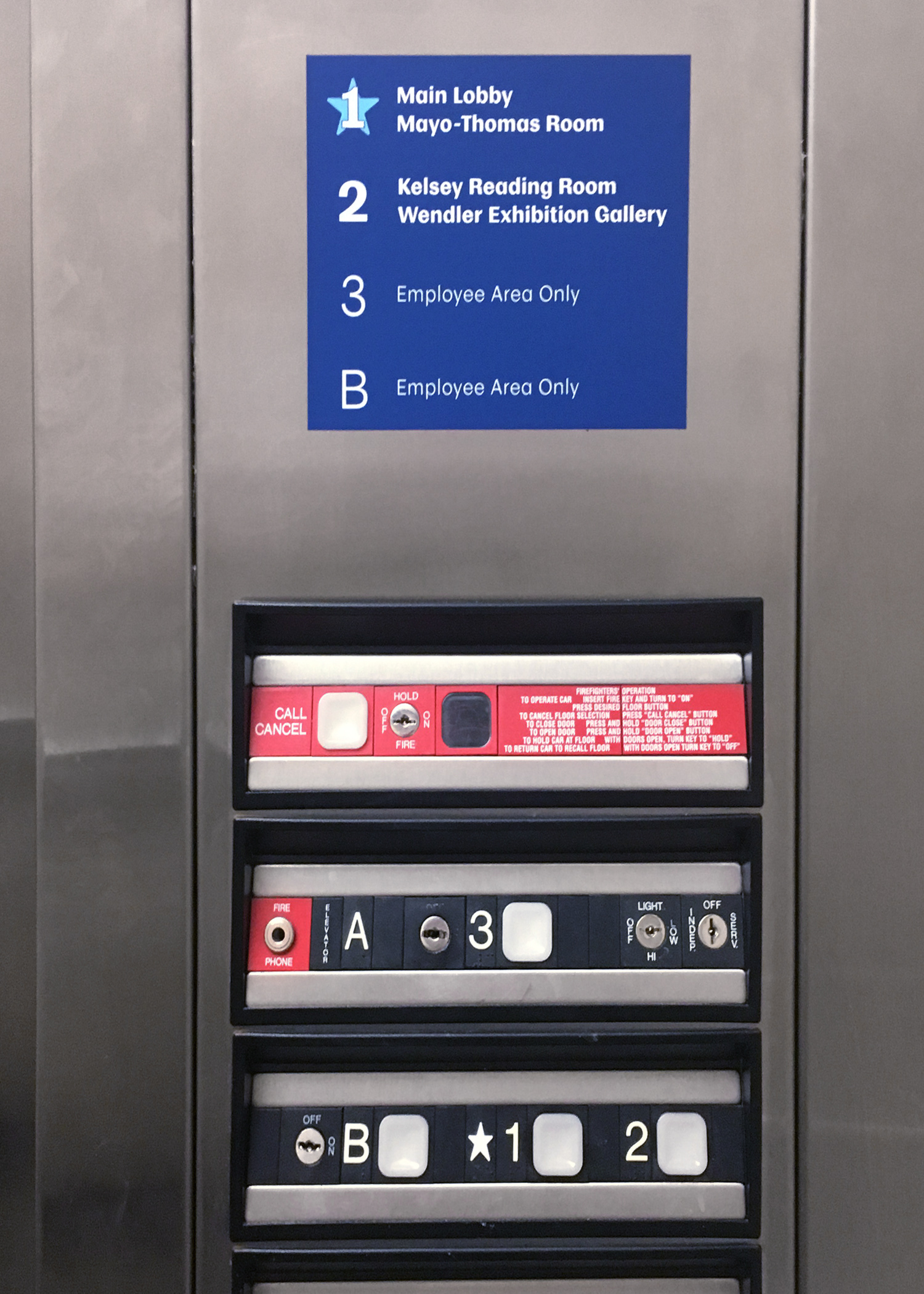
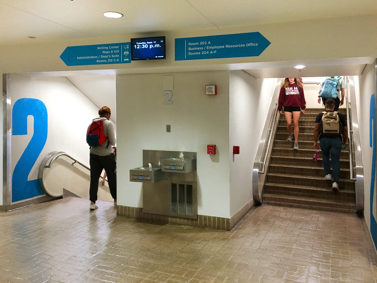
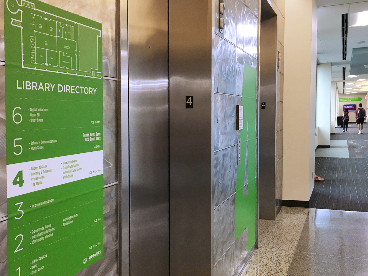
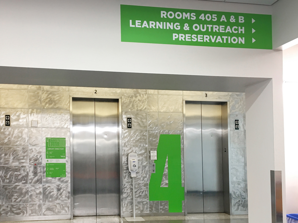
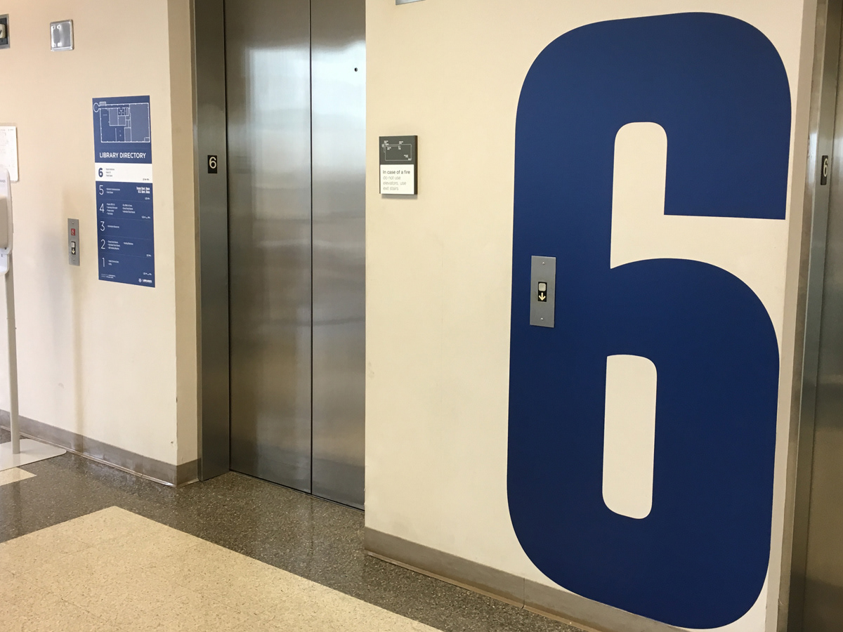
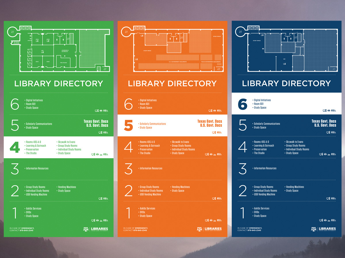
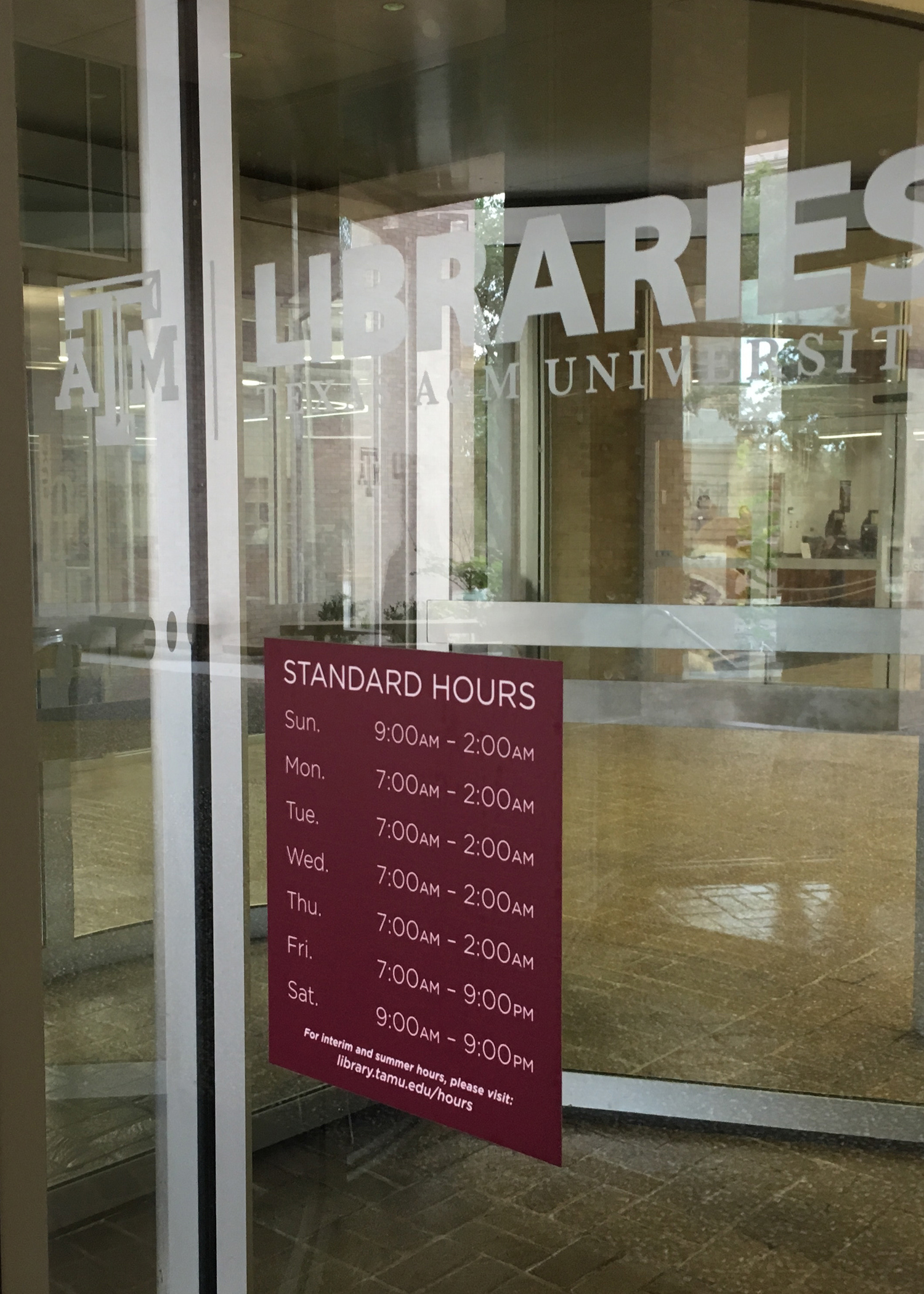
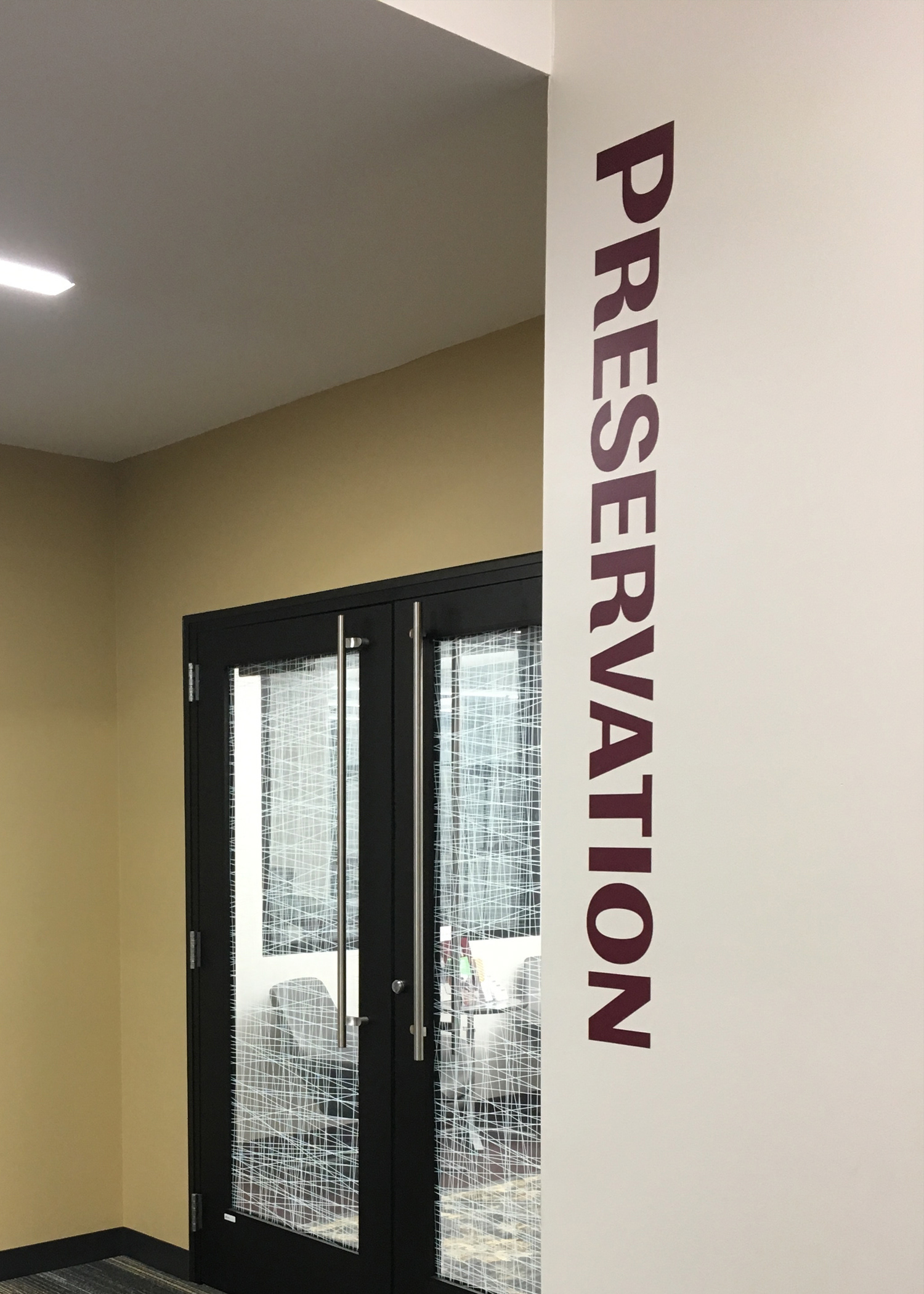
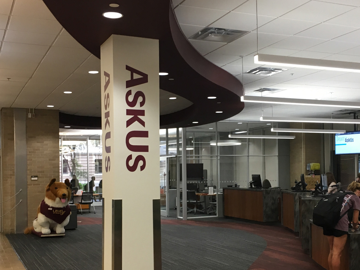
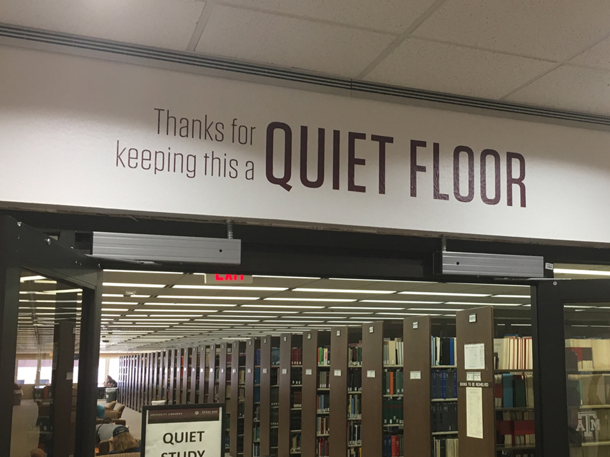
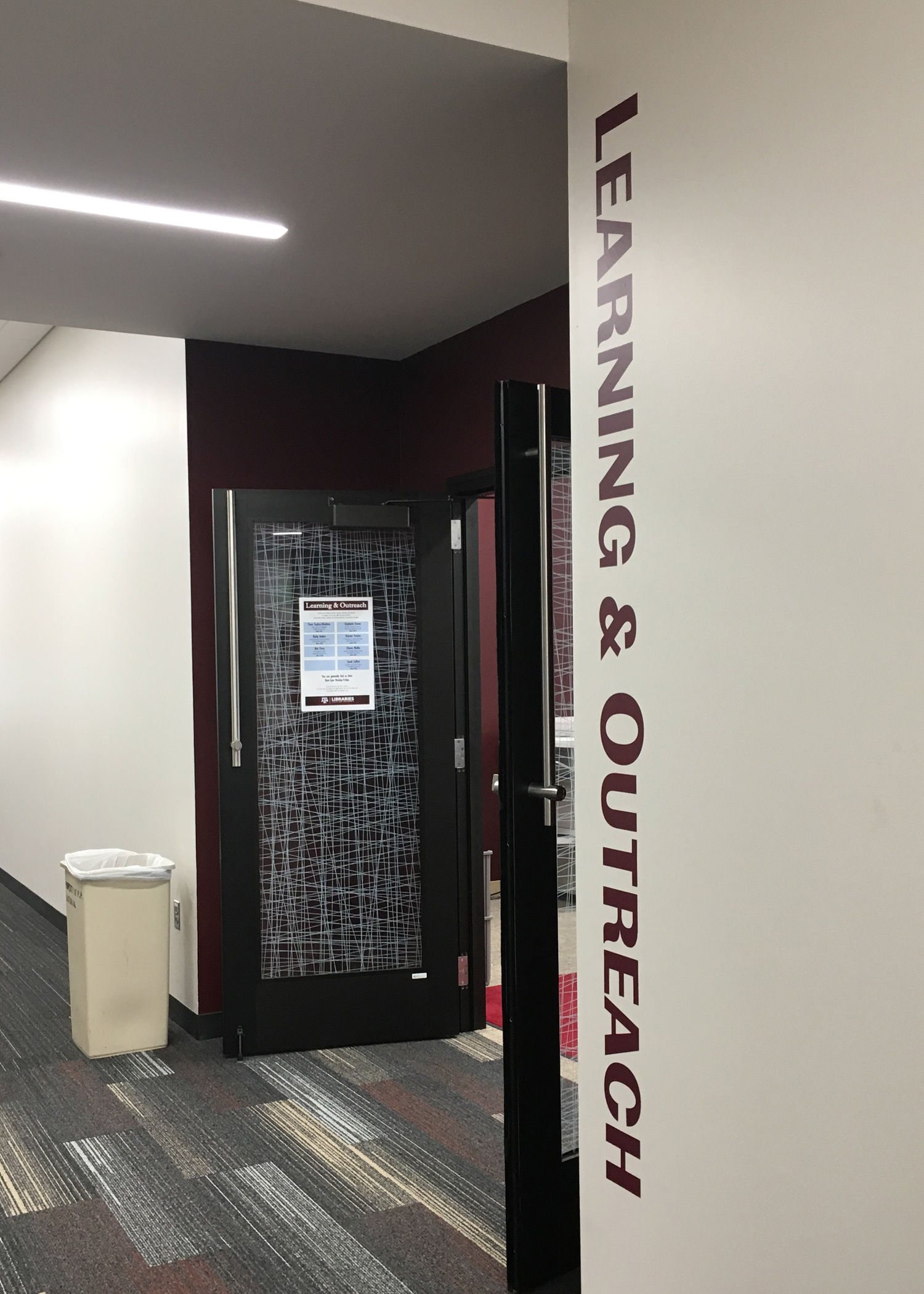
The Texas A&M University Libraries replaced dated directional signage that hung from the ceilings. With five buildings that had specific needs and challenges, I lead the team in designing signage that would meet all the different spaces needs.
We considered ADA guidelines, picking fonts that complemented university branding while remaining legible from large distances. We mapped out several point-of-need locations and service points. We chose and refined an icon library, color coded the floors, created new and flexible building maps, and wrote up guidelines for directional signage. The success of this project lies in its iterative design – vinyl being a semi-permanent, affordable, and replaceable product allowed us to update signs as new needs arise or floor plans changed.

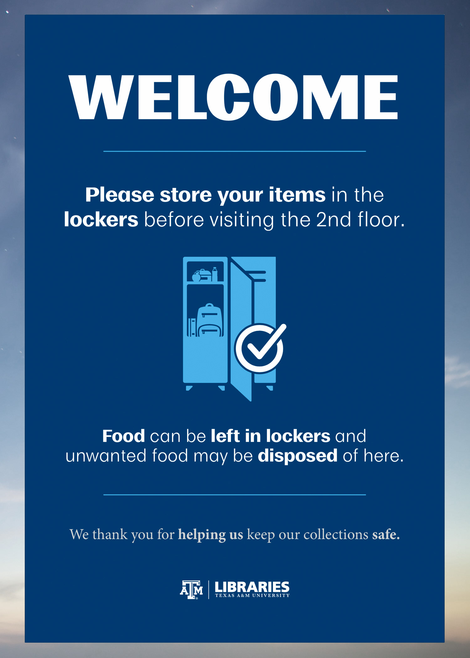
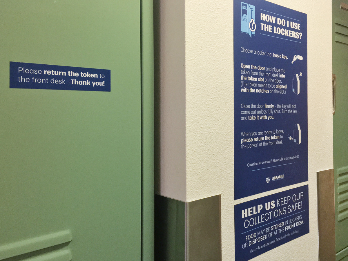
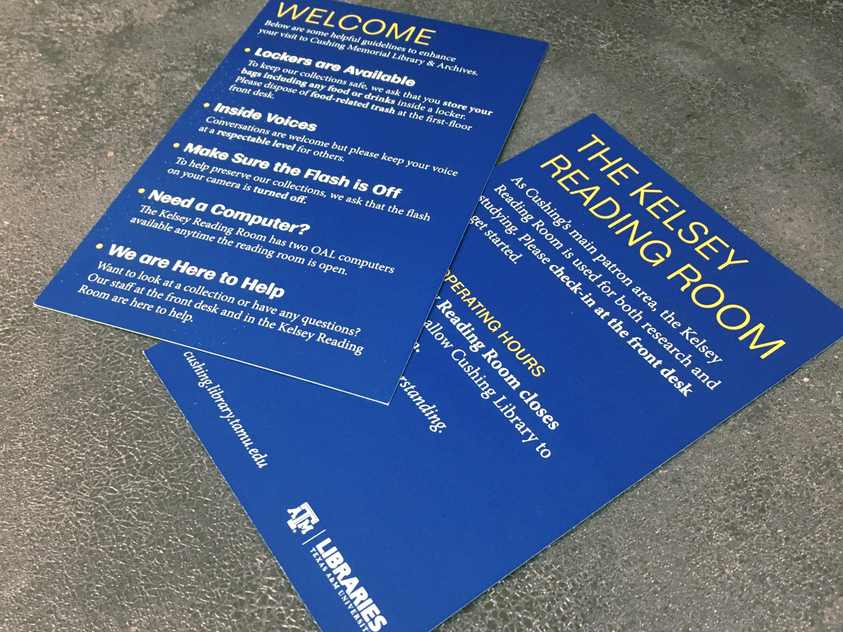
Welcoming Rules
Cushing Library, Texas A&M's oldest library, has several complex rules for patrons to follow to keep their collections safe. As the lead designer I used cooler colors to create a contrast with the warmer colors of the historic building and portray a calming and refreshing tone. I reworked the language of the rules to invite patron participation in protecting the collections and used a rounded font to add a subtle whimsical nature to the stoic environment.
